Come home to a beautifully warm spot!
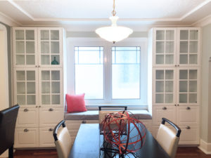
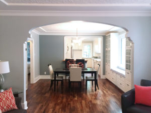
The richness of the floors pair well in contrast with the white molding, built-in cabinets, designed entryways, and cool-toned walls, which inspired our team to splash in touches of modern and bold!
See how the colours play so well here? This is the living and dining room areas, which fuse beautifully thanks to dark-toned furnishings (starting in the charcoal sitting area, expanded to the glass-top coffee table and dining set, both in a deep, rich flavour), and are further connected by a few beautiful elements – namely the throw pillows, table decorations and painting! As a result of the 60-30-10 rule (we did 60-20-20 with the cream and red), these areas connect very well.
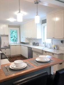
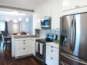
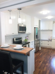
Add to this the stainless steel kitchen with that healthy touch of green to soften the stainless steel appliances, and you’re cooking with gasoline! (Actually, I think it’s an electric range… tough to tell from here!) This house was designed for consistency; when every room is empty, you still notice this, along the walls, the way the cupboards in one room match those in the other, the way that even limited spacing for paint in the kitchen is still accompanied by the same cool hue. This all adds charm to the home, and our decorators add in that extra flair, too – after all, it might be charming empty, but why leave it empty!?
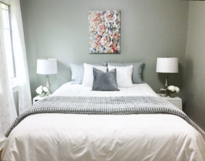
Lastly, the bedroom. What a comfy spot to come home to! Once again, our colours from the main area return in full. Although the walls in here are a different colour, they’re still in the cool family, which is mixed, matched, and ready to impress potential owners.
If you’re interested in viewing this property, check out the listing here!


