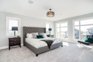
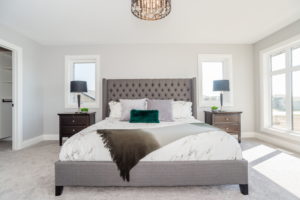
My word, this home is lovely. You walk in and are greeted with a beautiful vantage and a wide-open space. Our team was more than happy to breathe some additional style into an area that was already plenty stylish!
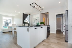
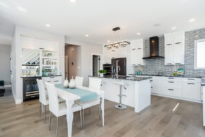
We’ll start with the dining area: with beautiful marbled counters, a funky backsplash, and the living room so nearby, we kept things simple, yet elegant in selecting the table. Pairing a chique cyan with the varying palettes of white-to-black was key in adding a lovely pop and amplifying the already-present cool tones. Then, in keeping with the palette, a little plant life on the counter works great!
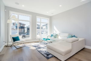
Moving to the adjoining space we use the brightness and the textures to once again create visual appeal, while choosing a colour scheme that fits not only the house (see the picture that we put up to the right of the fireplace!) but also continues to draw the eye with kitchen continuity. Another little touch: the cyan pillows we chose for the couch and chair, while mainly solid colours, also have large patterns. If a pattern is too small, it can lose its drama from a distance in becoming too grainy for the eye to discern.
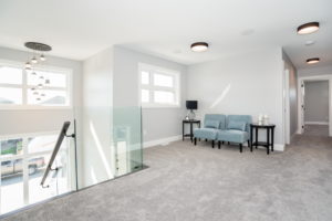
Upstairs, a cute little sitting area near the landing still holds to how we worked things along downstairs, and below, a perfectly symmetrical bedroom with a dramatically asymmetrical throw, whose gradient flows between the other elements of the room. Perfecto!
If you’re interested in taking a look at this gorgeous home in Saskatoon, here’s the link!


