
You may have seen this idea before, but maybe not – we’ve seen it called the 60-30-10 rule, and the 70-20-10 rule. At the end of the day, somewhere between those different values is what works, but the idea behind it is simple: by applying 3-4 colours to a room, you create a welcoming, often dazzling atmosphere that is sophisticated in its simplicity.
Here’s the breakdown, renamed just to avoid the metrics.
Part 1: The Main (60-70%)
This is your main wall, maybe the floor if carpeted, and the rug if on hardwood. It is the canvas upon which the rest of your colour will flow, and is often kept to an off-white or otherwise neutral tone.
Part 2: The Second Course (20-30%)
This is where you get to explore your creativity. Find a colour that has a decent amount of pop to it, and enjoy the splash of energy it brings to the space. Finding different patterns that fit this colour is encouraged. This is the pattern on your chair, or your throw pillow, or the decoration on your end table. You’ll be setting your shades well enough apart to create an impact.
Part 3: Dessert (10%)
Let’s get wild! This is where your throw pillows find an edge, and where that splash in the art you’ve hung really shines. For added effect, find an item or two that primarily show your Part 2 colour, but feature a dash of your Part 3. This doesn’t have to be a single shade, but can expand into several, as long as they’re from the same colour family.
Let’s look at some examples using homes we staged:

Here, we have an easy Main, with the beige wall and couch; the Second comes through in the deep-coloured woods that accent the table. As an aside, the darker shades that texture the rug also help draw a bridge between the Main and Second. Lastly, the wall art, covering and planters on the end tables all work in the cool range to draw the eye.
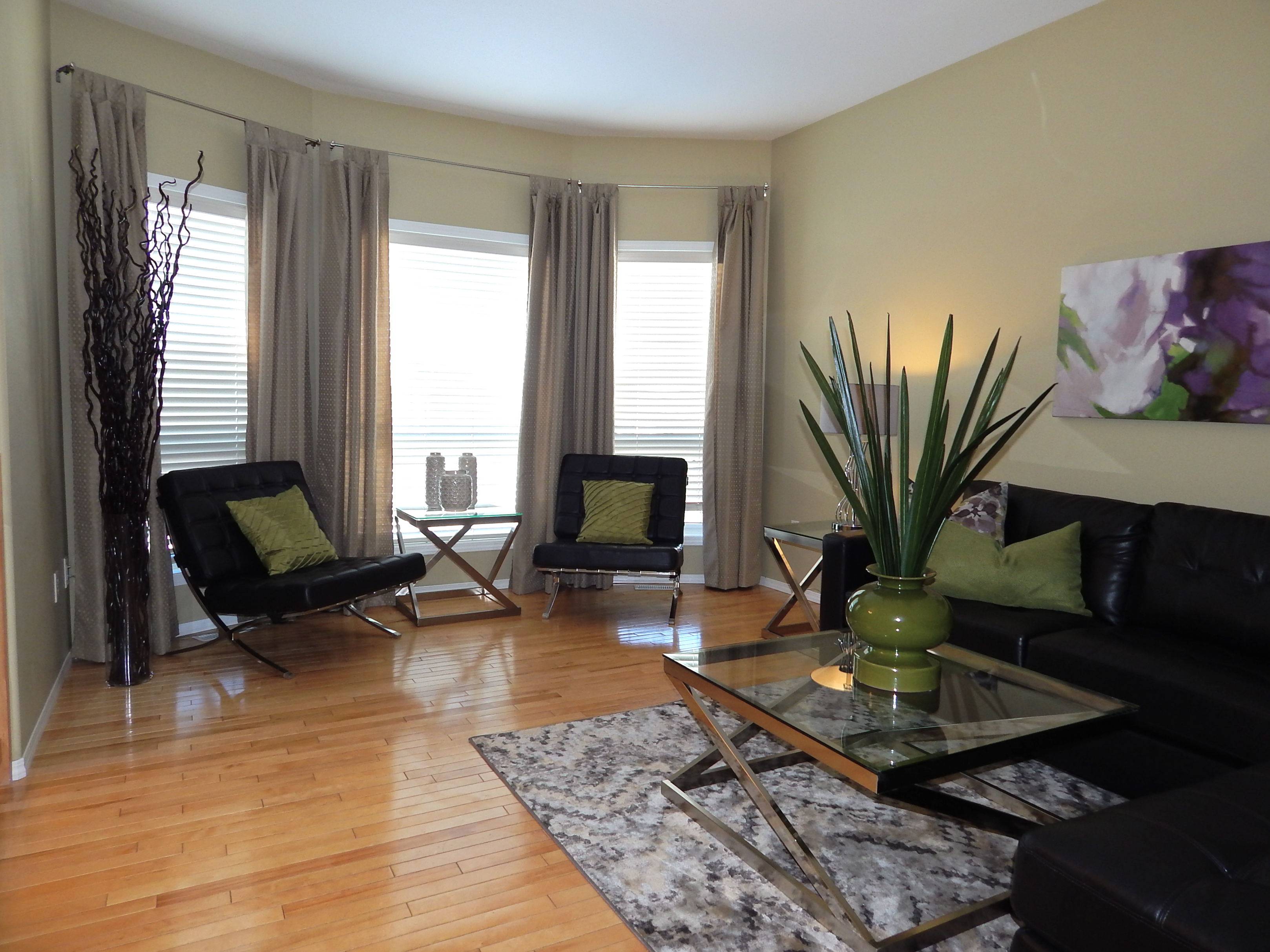
Here, we have a number of elements at work; in our Main, it’s still the neutral elements, but it’s a combination of the dark leather seating and the stainless steel bracketing, which blend thanks to a cooperative rug. In the Seconds, our eye is drawn to the green, which also works into the floor. The room is wonderfully pulled together by a combination of the art and the back throw on the couch, which both add a fuchsia element that really pops out of the space.
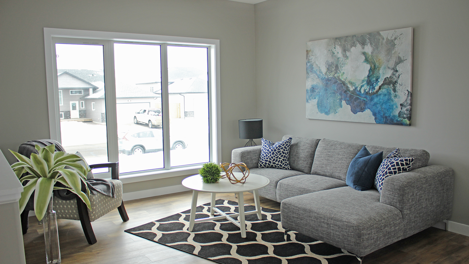
And lastly, a sign that all rules are made to be broken. Here, we use something of a 60-20-20 to great success. The Main is once again tonally neutral, but the Second (and Other Second, in this example) are the textured rug and pair of throws, and for the Second Second, the cooler shades (cyan and varying greens) create a peaceful blend.
There’s no one true right or wrong way to apply these rules. When in doubt, grab a colour wheel by the horns and take it for a spin. You’ll do great!
Live Fresh, friends!