When you walk into a room, what’s the first thing you notice?
This is a bit of a trick question, because the answer can be – whatever you want.
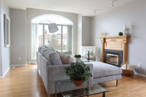
 The focal point of a room is the element in that room which most easily draws the eye. For some rooms, it’s easy: it’s the view out a window, or the fireplace, or the feature wall. For others, it’s as simple as the TV. In the room below, from a home we staged in Rosthern, we see “dueling focal points,” where a lovely bay window and a fireplace are set up side by side. Enlarge the image: where does your eye go? I’m betting the fireplace; here’s why. The curtains up around the window match the walls, and there are no feature walls to direct one’s attention, either; add to that the contrast and different elevations of decor along the mantelpiece, coupled with these colours as a recurrent theme in the case of the candlestick holder (bowl on the table) and the greenery. The brass fish, however, plays only off of the fireplace itself. The eye is then naturally drawn to it.
What if there’s no feature wall? What if there isn’t a big window to immerse a room around, or a fireplace? In this blog post, we want to cover the nonbasic focal point: the one that you create yourself. And the best part: you may need only rearrange a few pieces to make this happen.
Let’s look at some examples of projects our team has done!
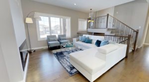
Let’s start in this room from a home staging we did in the winter.
There is a window here, and there is a fireplace here. Hm. Tough decisions ahead? Not this time! In spite of both of these elements being available, it’s actually the old adage of the largest item in the room catching the eye; the couch! The fireplace is into the wall, and becomes something of a pivot in the room when on, but otherwise doesn’t draw much attention. Without a bold set of curtains, the windows, too, are far from a focal. So, the bright white couch it is! Large objects can easily serve as your focal point; our team has done a good job of keeping other elements in the room at the couch’s level, but away from its primary white shade, while allowing the couch’s decor to bring the entire room together. Go go staging squad!
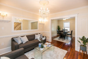
Next, another staged home we did – here’s a link to find out more about the style we went with!
This one was easy for our team, because like the fireplace, the design in here spoke for itself. In this case, it cam from the walls. When you have beautiful wall ornamentation, as this property did, letting it speak for itself by toning the base colours down is a really smart option. In this example, it’s built-in, but a mirror can easily act as the statement piece of a room. It’s working very well here!
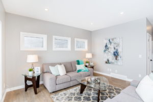
Our last example showcases another way you can take a space without much colour to begin with and cause an element to really pop! Picture this space before it was furnished. It’s cozy. It has lots to offer, but the windows won’t scream “wow” at you. Then, we touched it up with some lovely, trendy, and comfortable decor. In this case, it can’t be the sofa and matching loveseat – it’s meant to be a singular object. The table in the center is the shortest element in the room, so that’s out… well, well, look what’s tying this room together on the wall, there! Yep – art works too. Especially if it works as a binding element for the colour in the room.
When it comes to focal points, stick with your favourites. Work around them. And remember – if you’re ever having trouble, call us! Head to our website and book a consultation. We’d be more than happy to help!


