
Our amazing team put on a real clinic with these suites! Because they’re in condominiums, the challenge becomes decorating to accommodate unidirectional windows – apartment-dwellers, take notes!
We’ll start with the living rooms. Yes, I said rooms! We’ll be looking at two sets of living spaces today!

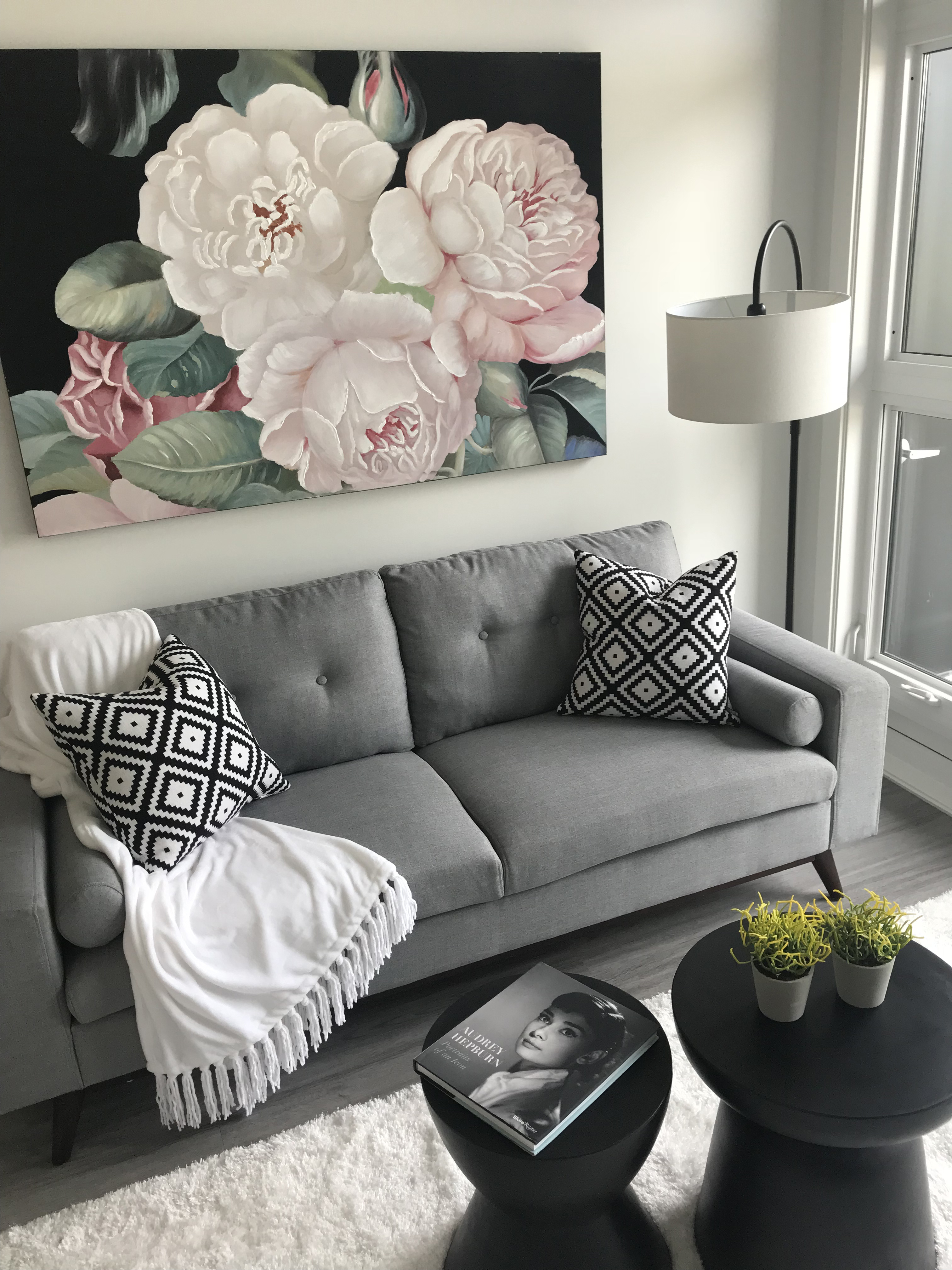

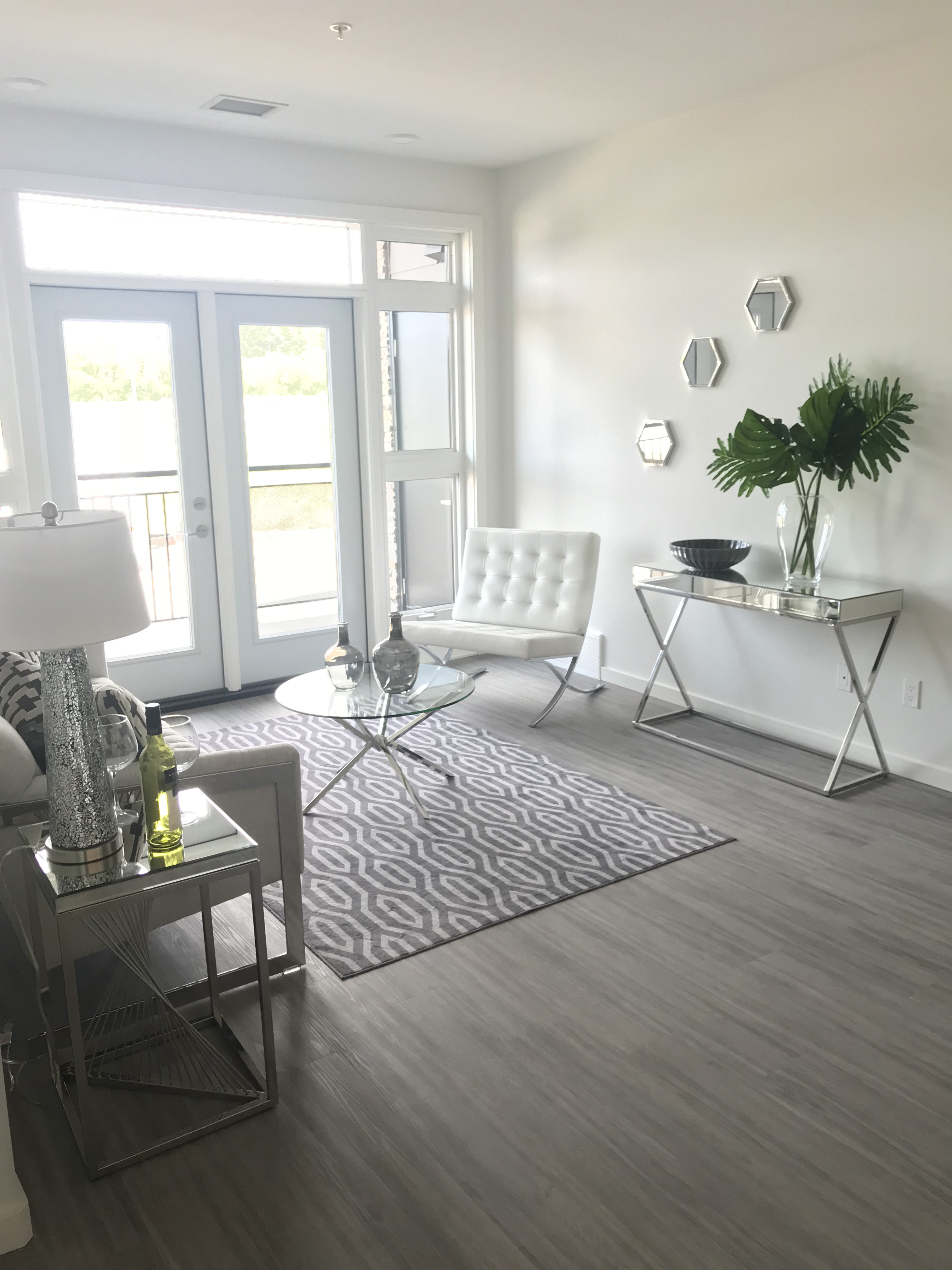
This is a pretty reasonable amount of space. What we’ve done is applied the 60-30-10 rule between monochrome-warm tones-pink flushes, respectively. Why pink? Well, the light coming in the windows, in spite of our neutral wall finish, is warm. This pinky, peachy tone makes for an excellent accent to help flush the warmth out of nearly everything! The matching flowers in the first photo help us derive an extension of the tone created in the living room. Pro tip: the mirrors help widen the space even more, as well!


In the second suite, a look that blends classical, timeless, and a hint of modern. Gold and green pair so well together, and the creme finish creates this dramatic look, helped along by the black-and-white framed art. The pillows and carpet share a colour scheme but differ tremendously in pattern, helping to create this visually gorgeous room. A similar style could be applied to any well-lit space in your own home – our people would be more than happy to help!
Using the same scheme as before, we’ll move on to the bedrooms.
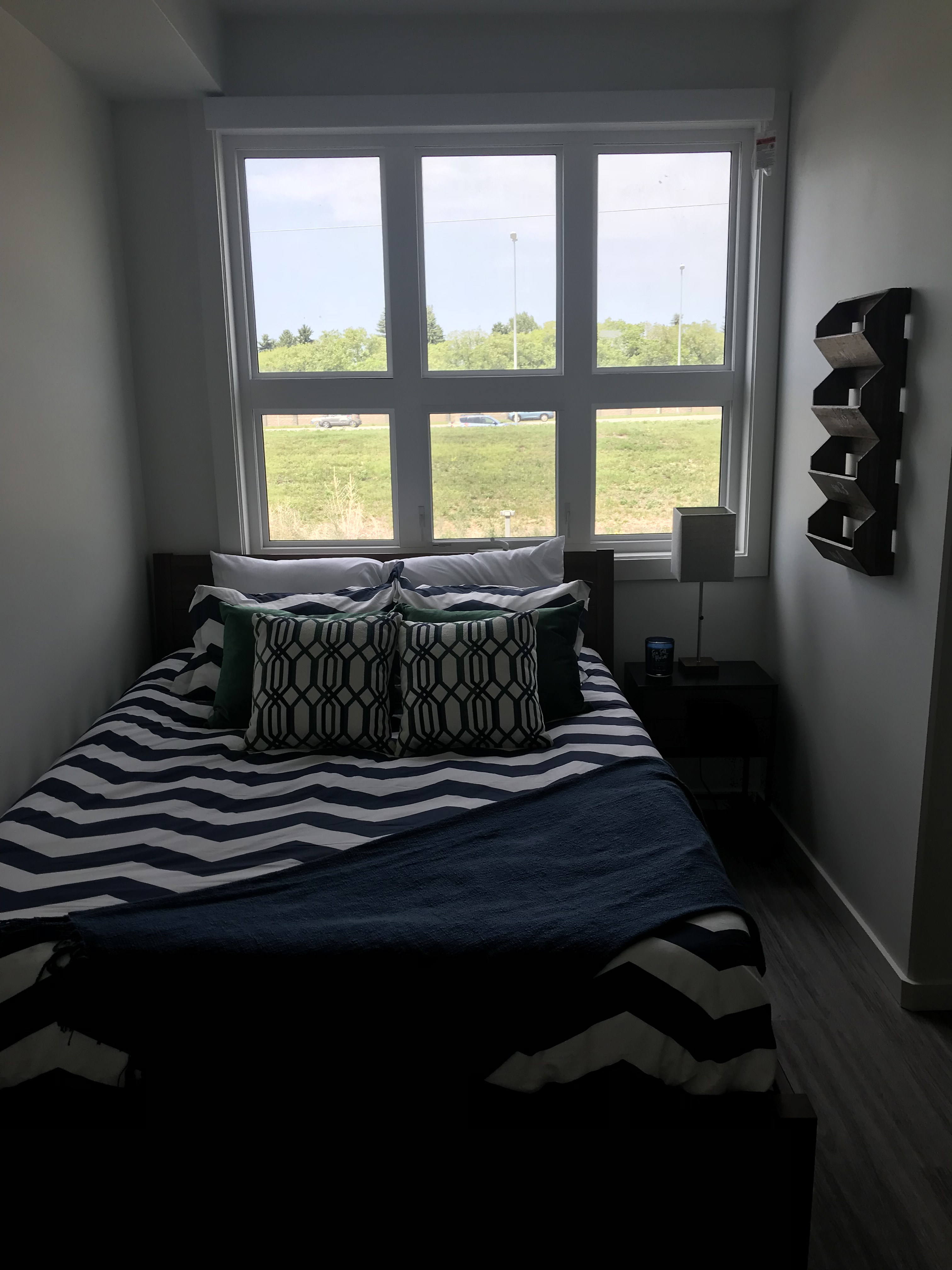
This set shows the value of both simplicity and practicality. In a narrow corridor, matching the bed frame to the end table to the filing setup on the wall (tough to picture in these images, but it’s a rich brown!), paired off with another batch of colourless elements in the bedsheets, that is then quartered with some cool tones (note the green pillows in addition to the navy sheet). As I mentioned off the top, this is a tough project in such narrow spacing! Nevertheless, our team did a great job working with it and created a chique, comfortable space.
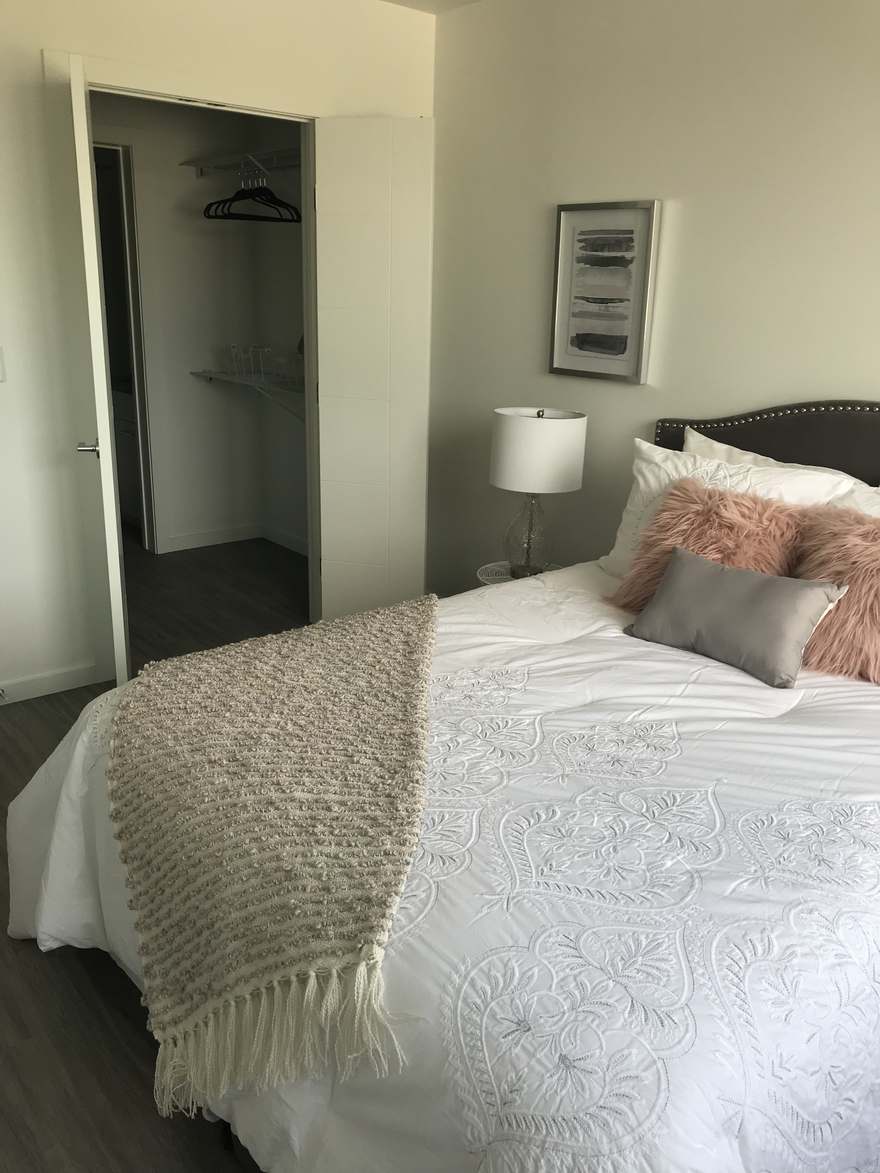
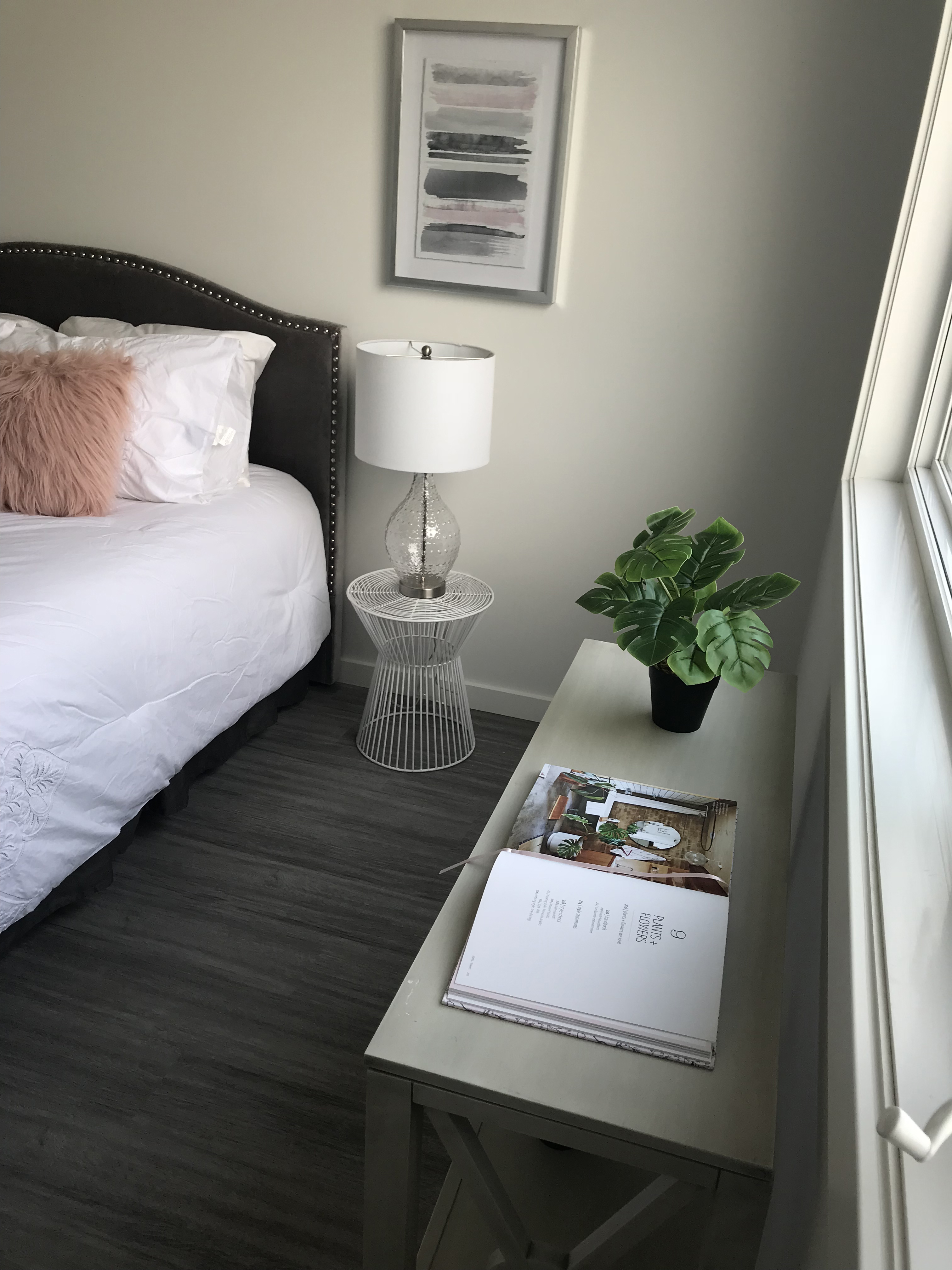
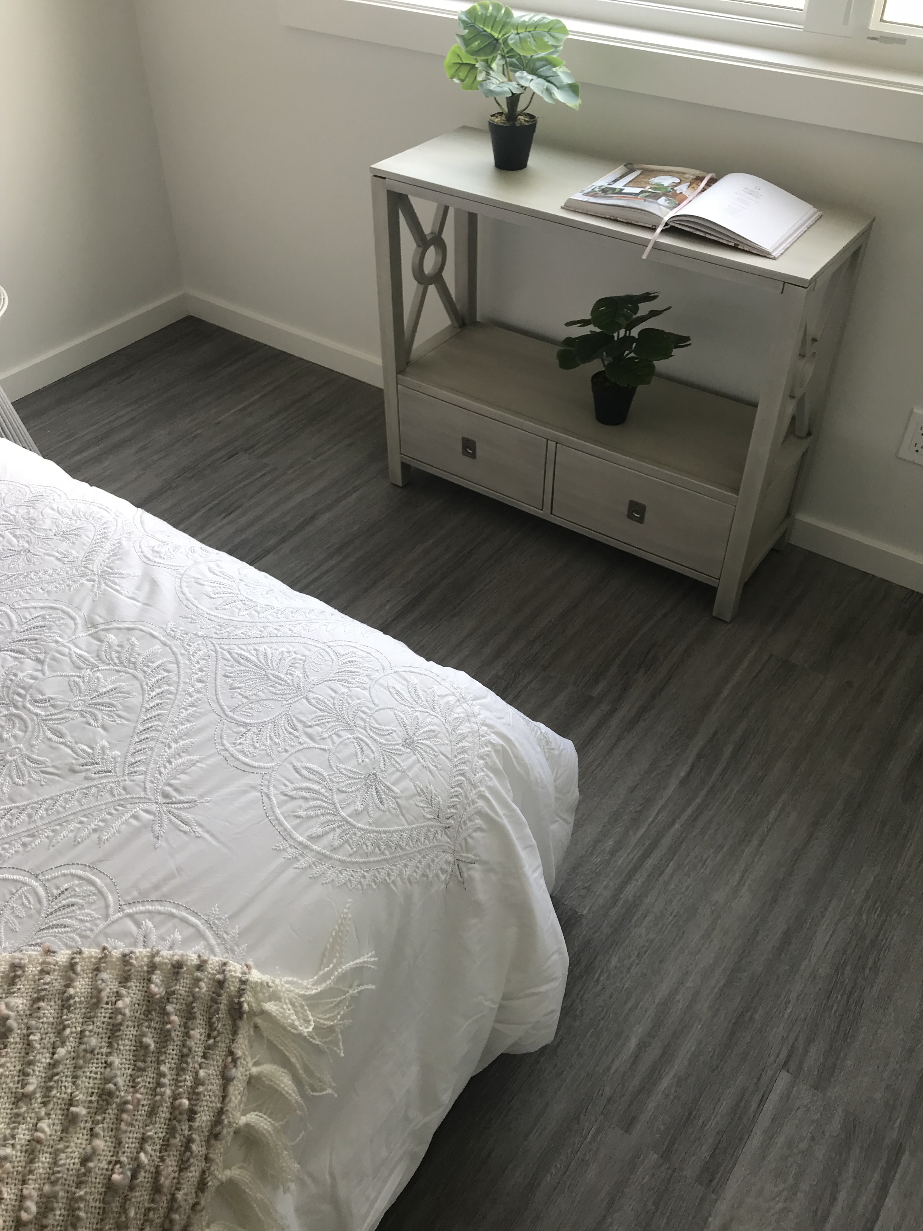
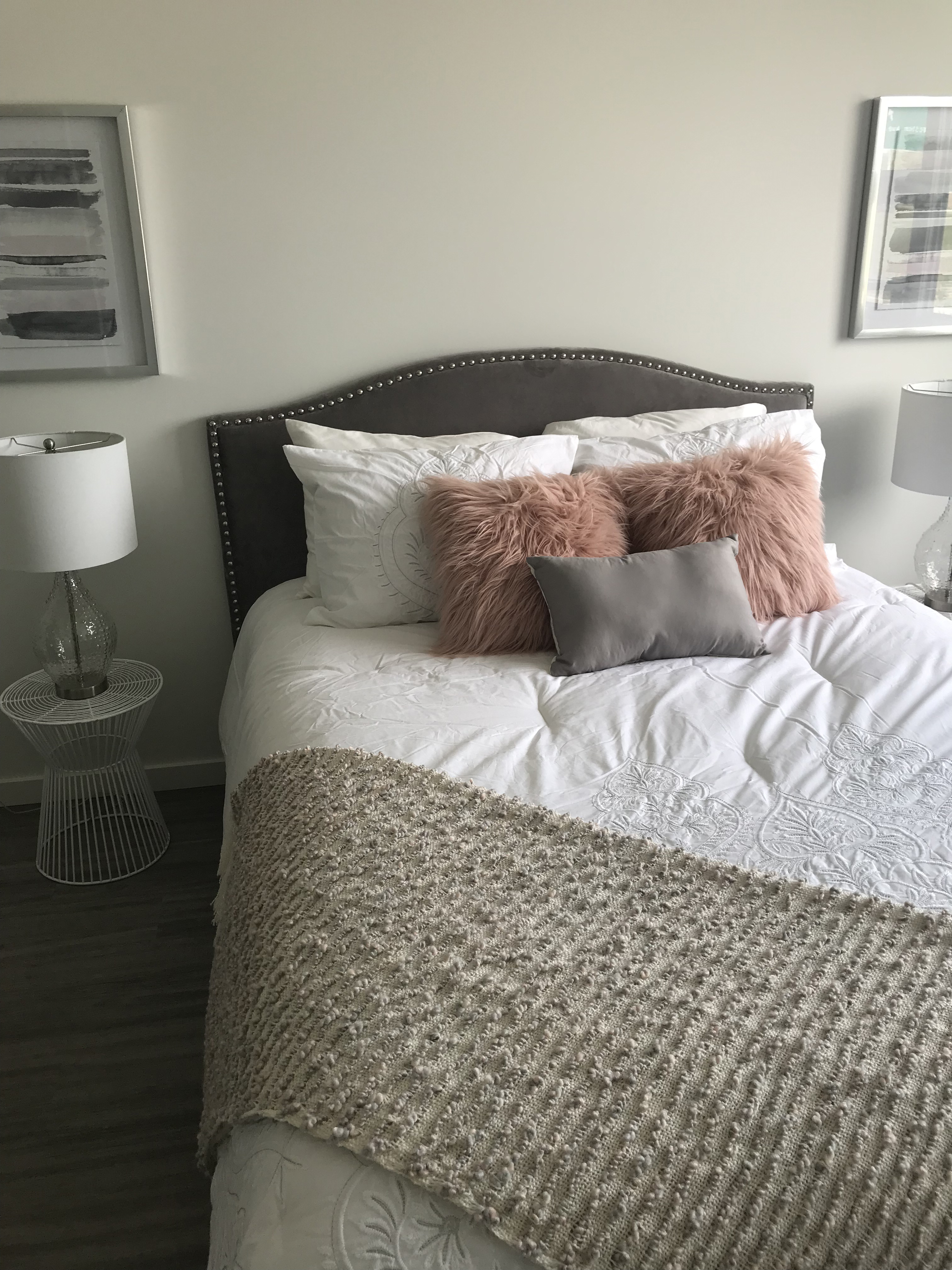
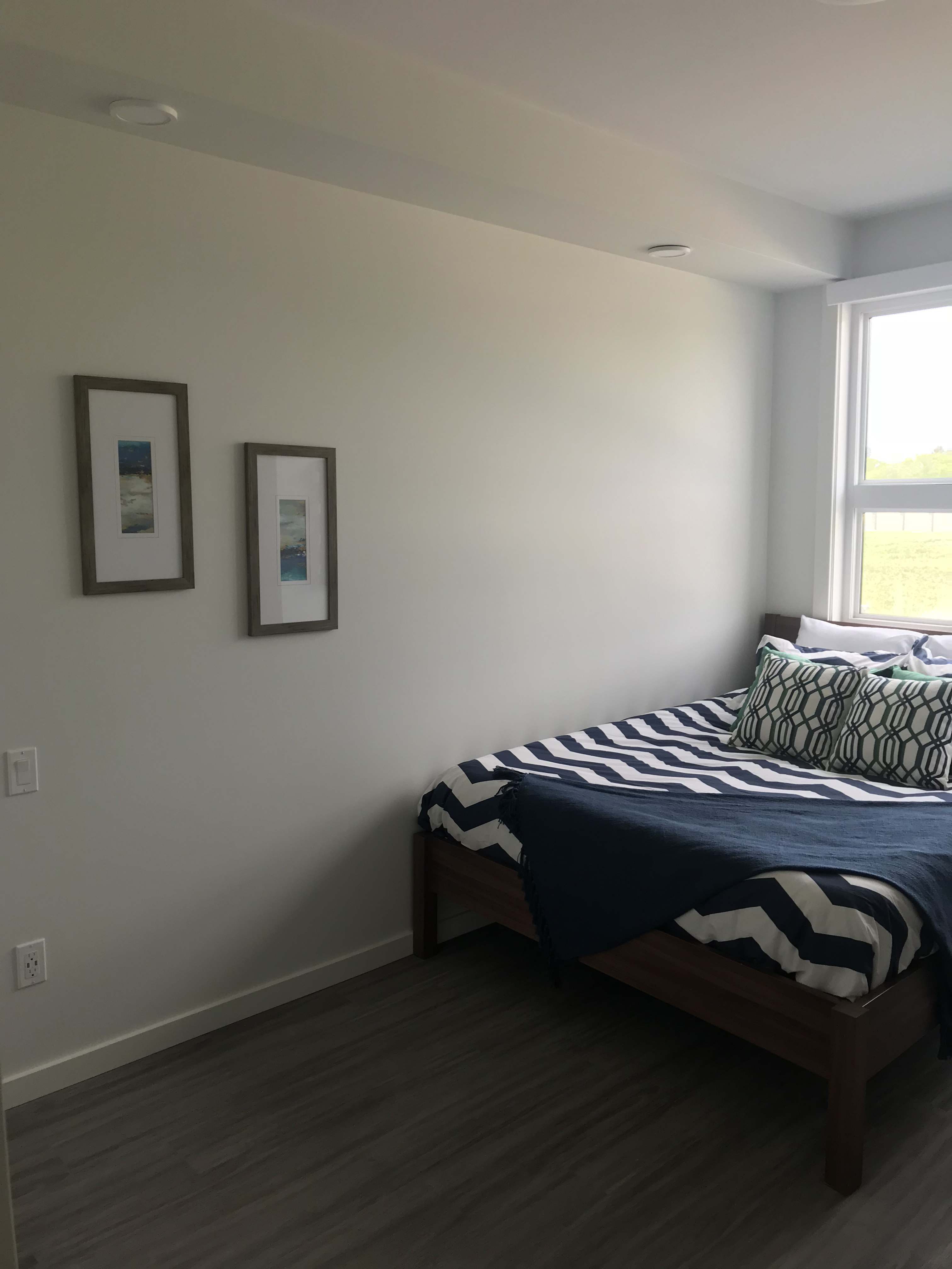
Lastly, this set in the main bedroom of our “modern-yet-classical” home; the same idea applies as before, utilizing a oorner-sheet to add another dimension. In this case, textures are also applied differently across numerous pillow surfaces, as well as the choice in wall decor. The earth tones in the multiple green elements trace well, and further continuity is added with the salmon-coloured pillows; these play off of the warm hues, of course, but also work with the gold in the living space.
We hope this article inspires your next home project, and that you consider consulting our stylists for more information! Also, a big thanks to Timbercreek Communities for being our partners and letting us stage!